Visual Components
Common Attributes
- class : Will add all classes in this field
- tabindex : Will include tabindex support for entry fields with sequence when hitting tab key.
- readonly : Component will be read-only.
- maxlength : Maximum length for entry components.
- value : Value.
- name : Name of component
Check

List of options with checkbox render. Allows horizontal or vertical render of list of entries. Checkbox can
be placed before or after the field entry and labels can be at top or left.
Html
<div id="id_mycheck_comp" data-xp-type="check" data-xp="{alignment: 'vertical'}" > </div>
Attributes
label : Label
size : Input box size
helpText : Tooltip to show
info : Weather to show tooltip.
labelWidth : Width for label
alignment [optional] : ‘vertical’, ‘horizontal’
hasLabel [optional] : “true” or “false”. Weather to show or not a label, at left or top of check controls.
- labelPosition [optional] : ‘top’|’left’. Label position, left of check buttons, or top for label at one line and check
controls on a new line.
controlPosition [optional] : ‘before’|’after’. Default: ‘before’. Position for the check control, after or before text.
Interfaces
- IInputList : Interface for list of entries
Methods
- render : Render
- enable : Enable
- disable : Disable
- unrender : Reset
Container
Set of visual components.
Supports conditions. You can place your visual objects inside containers to force condition for rendering.
Conditions are defined in the view definitions with attribute data-xp-cond-rules, like:
<div id="id_view"
      data-xp="{viewName: 'signup'}"
       data-xp-cond-rules="{hasUserAuth: 'settings.SIGNUP_USER_PASSWORD == true',
                            hasNetAuth: 'settings.SIGNUP_SOCIAL_NETWORK == true',
                            socialNetLogged: 'socialNetLogged == true'}" >
</div>
Html
<div id="id_passwordAuth" data-xp-type="container"
               data-xp-cond="{conditions: [
                                    {condition: 'socialNetLogged', render: false}]}" >
      ...your objects...
      <div ... > </div>
</div>
Attributes
data-xp-type : container
- data-xp-cond :ListType : Condition objects, like [{}, {}, ...] First matched condition will execute action
- conditions :ListType : List of conditions:
- condition : condition key from data-xp-cond-rules
- action : Supported values: ‘render’
- value :Boolean : true / false
Content
Allows to embed server-side data into templates.
Inserts into templates data from visual context. If you have form_mine and want to refer field name, you would:
You can also add objects to your visual context from server-side in your services:
self._add_attr('customer', customer)
Where customer may be any serilizable object.
and you would:
To display customer name.
Html
<a href="{{object.url}}" title="{{object.title}}" data-xp-type="content" >{{object.title}}</a>
We would have object in our visual context.
Field
Field with formatting option and tooltip with helpText attribute. Option to provide auto-complete
from choices or server-side data.
Html
<div id="id_countryTxt_comp"    data-xp-type="field"
                                data-xp="{  label: 'Country Code', size: 2}"
                                data-xp-complete="{     choicesId: 'country',
                                                        choiceDisplay: 'name',
                                                        minCharacters: 1    }"> </div>
Attributes
- label : Label
- size : Input box size
- helpText : Tooltip to show
- info : Weather to show tooltip.
- labelWidth : Width for label
Attributes for auto-completion choices
- choicesId : Choices id to reference to show list.
- choiceDisplay [optional] default:value : name|value. Display either name or value from choices.
- maxHeight [optional] : Max height of autocomplete box
- minCharacters [optional] : Min characters to trigger auto-complete box.
Attributes for auto-completion server-side
- app [optional] : Application code
- dbClass : Data class to show results from.
- searchField :String : Search field to match for text from input field.
- maxHeight [optional] : Max height of autocomplete box
- minCharacters [optional] : Min characters to trigger auto-complete box.
- params [optional] :Object : Parameters to filter completion list.
- fieldValue [optional] :String : Field to show results. In case not defined, will use the model string representation.
- extraFields [optional] :List : Fields to show in extra Object
methods
- render : Renders the component
- complete : Bind autocomplete behavior
- enable : Enable field
- disable : Disable field
- unrender : Reset (remove) component data and remove data-xp-render attribute.
FieldCheck
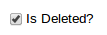
Renders fields that are BooleanField, with values true / false or 1 for true and 0 for false
Support labels. Check control can be before label or after.
Html
<div id="id_hasUrl_comp" data-xp-type="field.check" data-xp="{}" > </div>
The above code will just show a checkbox with True/False logic. You can include label as well.
This case would show checkbox and a message after the box to agree to terms and conditions in a web site:
<div id="id_agree_comp" data-xp-type="field.check"
                        data-xp="{  label: 'I agree to terms and conditions',
                                    controlPosition: 'before'}" > </div>
Attributes
- label [optional] : Label
- helpText [optional] : Tooltip to show at label
- info [optional] : Weather to show tooltip at label.
- labelWidth [optional] : Width for label
- controlPosition [optional] : ‘before’|’after’. Default: ‘before’. Position for the radio control, after or before text.
Methods
- render : Render
- enable : Enable
- disable : Disable
- unrender : Reset
FieldDateTime
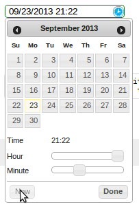
- Date and Time field representation. This component renders form fields Date, DateTime and Time.
- When field type is Date, a date tooltip will popup to select date.
- When field type is Time, a time tooltip will popup to select time with two selection bars for hour and minute.
- When field type is DateTime, a date with time tooltip will show up with calendar and time bars.
Html
<div id="id_updateDate_comp" data-xp-type="field.datetime" data-xp="{}"> </div>
Type can be field.datetime, field.date or field.time.
Attributes
- label [optional] : Label
- helpText [optional] : Tooltip to show at label
- info [optional] : Weather to show tooltip at label.
- labelWidth [optional] : Width for label
- hasLabel [optional]
- labelPosition [optional]
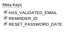
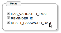
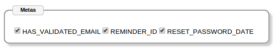
FieldList
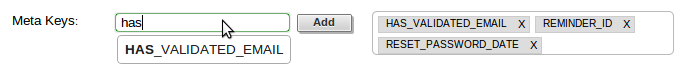
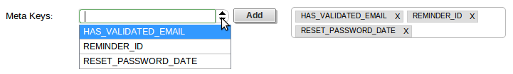
List of fields. Fields can be added and deleted. Can represent the many-to-many relationships in models.
They can be rendered as tags horizontally.
Html
Input:
<div id="id_meta_comp"  data-xp-type="field.list"
                    data-xp="{  type: 'field',
                                labelWidth: '100px',
                                modelField: 'meta__name'}"
                    data-xp-complete="{ choicesId: 'metaKey',
                                        minCharacters: 1  }" > </div>
Select:
<div id="id_meta_comp" data-xp-type="field.list"
            data-xp="{  type: 'select.plus',
                        selectObjId: 'id_metaKey_comp',
                        labelWidth: '100px',
                        choicesId: 'meta'}" > </div>
Attributes
- type:string [default: field] [optional] : Type of control for adding values: field and select.plus possible values.
- labelWidth:string [optional]
- selectObjId:string [optional]
- modelField:string [optiona] : For field input type, the model field value. Required for fields. Not required for select input.
- choicesId
Methods
- render : Render.
- keypress : Deals with Enter key stroke and adding clicked to list of entries.
- enable : Enable
- disable : Disable
- unrender : Reset
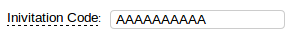
FieldNumber
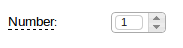
Html
<div id="id_number_comp" data-xp-type="field.number"
                        data-xp="{  size: 2,
                                    labelWidth: '100px',
                                    info: true,
                                    helpText: 'Number of invitations'}" ></div>
Attributes
- label : Label
- size : Input box size
- helpText : Tooltip to show
- info : Weather to show tooltip.
- labelWidth : Width for label
- hideSpinner :Boolean : Hides spinner control
Methods
- render : Render
- enable : Enable
- disable : Disable
- unrender : Reset
Function
Allows to render content based on a javascript function.
Html
<div id="id_facebookSignup_comp"
    data-xp-type="function.render"
    data-xp="{functionName: 'ximpia.external.Facebook.renderSignup'}" > </div>
You can add attributes to data-xp and refer to those in your javascript function.
Your javascript function would be like:
ximpia.external.Facebook.renderSignup = (function(attrs, callable) {
    // Code
}
attrs are the attributes from data-xp html attribute.
Attributes
- functionName : Path to javascript function name
Any additional attributes you define
Link
Hyperlink which would trigger a new view or call an action.
Links used to:
- Launch views (new and popups) - launchView
- Open popups (openPopup) - openPopup
- Launch actions - doAction
- Link to url - callUrl
Types are:
- link.popup
- link.url
- link.view
- link.action
Html
<div id="id_passwordReminderLinkUrl_comp" data-xp-type="link.url"
        style="margin-top: 20px; margin-left: 20px"
    data-xp="{  op: 'callUrl',
                url: '/',
                target: '_blank',
                width: 800,
                height: 600,
                title: 'go to home...',
                linkText: 'Take me to Home'}" ></div>
<div id="id_lnkCode_comp" data-xp-type="link.view"
        style="margin-top: 20px; margin-left: 20px"
    data-xp="{  op: 'showView',
                app: 'ximpia_site.web',
                title: 'go to home...',
                linkText: 'Show Code',
                view: 'code'}" ></div>
<div id="id_lnkSignout_comp" data-xp-type="link.action"
        style="margin-top: 20px; margin-left: 20px"
    data-xp="{  op: 'doAction',
                app: 'ximpia.site',
                title: 'will logout...',
                linkText: 'Logout',
                action: 'logout'}" ></div>
Methods
- render
- click
- disable
- enable
ListContent
You include a div for the component definition and html inside this div can be any html element that will
be repeated for each row in the list. You include data with {{}} notation. Response context has elements for lists
with list_myList``where myList relates to ``id_myList_comp. This way you don’t have to repeat {{list_myList.data.myField}} and only
need to include {{data.myField}}. You can include list values, header values and meta values for the list.
You can include any element in three positions: jxListContentHeader, jxListContentBody and jxListContentFoot. Body position will incude
the rows to be repeated in the list with values. Header will include content before list and foot includes any content you need at end
of list.
<div id="id_myList_comp" type="list.content"
        data-xp="{dbClass: 'MyDAO', fields: ['myField']}">
<$htmlElement class="jxListContentHeader">
Here go the results...
</$htmlElement>
<$htmlElement class="jxListContentBody">
{{header.myField}}: {{data.myField}}
</$htmlElement>
<$htmlElement class="jxListContentFoot">
numberPages: {{meta.numberPages}}
</$htmlElement>
</div>
Example:
<div id="id_groups2_comp" data-xp-type="list.content"
                            data-xp="{  app: 'ximpia.xpsite',
                                        dbClass: 'GroupDAO',
                                        numberResults: 1,
                                        fields: ['id', 'group__name']   }" >
<div class="jxListContentHeader">
     These are the results you will have...
</div>
<div class="jxListContentBody" style="border: 1px solid; height: 30px; width: 600px">
     {{headers.group__name}}: {{data.id}} - {{data.group__name}}
</div>
<div class="jxListContentFoot" style="margin-top: 10px; margin-bottom: 10px">
     Number pages: {{meta.numberPages}}
</div>
<div class="jxListContentFoot" style="margin-top: 10px">
<div id="id_groups2_paging_comp" data-xp-type="paging.more"
        data-xp="{compId: 'id_groups2_comp'}" class="ui-list-content-paging">
    More Results...
</div>
</div>
Attributes
- dbClass :string
- app :string [optional]
- method :string [optional] [default:searchFields] : Data method to execute
- fields :object<string>
- args :object [optional] : Initial arguments. Object with arguments
- orderBy :object [optional] : Order by fields, ascending with ‘-‘ sign before field name. Supports relationships, like ‘field__value’
- disablePaging :boolean [optional] [default: false]
- pagingStyle :string [optional] [default:more] : Possible values: more
Methods
- render
- insertRows (xpForm:string, result:object) : Inserts rows into content list.
ListData
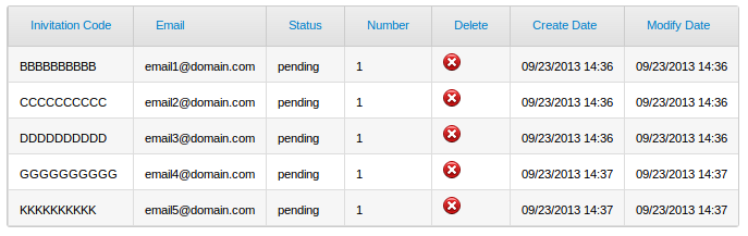
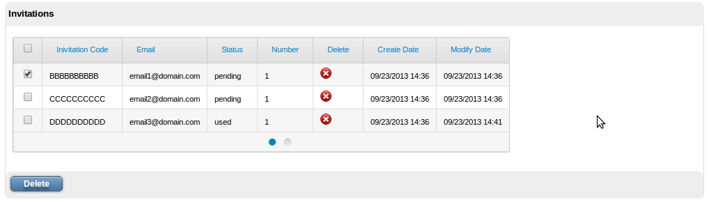
Check out images for PagingMore and PagingBullet for ListData paging support.
Html
<div id="id_myList_comp" data-xp-type="list.data"
        data-xp="{dbClass: 'MyDAO', fields: ['name','value']}" > </div>
Attributes
- dbClass :string
- app :string [optional]
- method :string [optional] [default:searchFields] : Data method to execute
- detailView :object [optional] <viewPath, winType>: View to display detail. hasLinkedRow must be true. Full path, like ‘myProject.myApp.myView’. winType can be window``or ``popup
- detailType :string [optional] [default:window] : Window type: window, popup.
- fields :object<string> [optional]
- args :object [optional] : Initial arguments. Object with arguments
- orderBy :object [optional] : Order by fields, ascending with ‘-‘ sign before field name. Supports relationships, like ‘field__value’
- disablePaging :boolean [optional] [default: false]
- caption :string [optional]
- headComponents :object [optional] : List of header components. Possible values: search|filter
- hasCheck :boolean [optional] : Table has operations linked to row checks. User would check rows and click button to execute actions on checked items.
- activateOnCheck :object : List of components to activate when row check is clicked.
- onCheckClick :string [optional] [default:enable] . Enable or render action components when user clicks on check.
- hasHeader :boolean [optional] [default:true]
- pagingStyle :string [optional] [default:more] : Possible values: more, bullet
- pagingMoreText :string [optional] [default:More Results...] : More paging text
- hasLinkRow :boolean [optional] [default:false]
Methods
- render
- insertRows (xpForm:string, result:object) : Result contains keys data, headers and meta for list result
Image
Renders into img html element.
src html attribute is generated using attributes file, location and hostLocation. Only required attribute is file. You
can define src attribute with full path for images.
Html
By class:
<div id="id_myImage_comp" data-xp-type="image" data-xp="{imgClass: 'checkSmall'}" > </div>
Using images location and default host location:
<div id="id_myImage_comp" data-xp-type="image"
            data-xp="{file: 'github-icon-source.jpg'}" > </div>
Using S3 host location:
<div id="id_myImage_comp" data-xp-type="image"
        data-xp="{file: 'github-icon-source.jpg', hostLocation: 'S3'}" > </div>
Using cloudfont host location:
<div id="id_myImage_comp" data-xp-type="image"
        data-xp="{file: 'github-icon-source.jpg', hostLocation: 'cloudfront'}" > </div>
Using src:
<div id="id_myImage_comp" data-xp-type="image"
    data-xp="{src: 'https://ximpia.s3.amazonaws.com/images/github-icon-source.jpg'}" > </div>
Attributes
- imgClass : Image file name is blank.png. Image has background from css class.
- file : Phisical file name with extension, like myphoto.png. In case version attribute is defined, phisical file name will be modified to include version in the url. In case src is defined, this field is not required.
- location [optional] : Location name. Locations are mapped into settings.js file. In case no location is defined, we use images location. Locations are mapped into paths.
- src [optional] : In case you want to define path instead of location. In case you have path, you don’t need attributes file, location or hostLocation.
- hostLocation [optional] : Host location mapping to use. You can define in settings alternate host location for your images, like ximpia.settings.hostLocations[‘S3’] = ‘https://ximpia.s3.amazonaws.com/‘. In case not defined, will use the default host location. This way for images can point to S3, local, cloudfront, etc...
- title : Tooltip to show when mouse is placed over image.
- version [optional] : Version to generate url for image versions. In case to include version you need no ``dimensions``attribute. Dimensions from version will be used.
Option
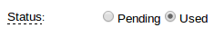
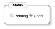
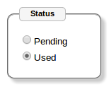
You can have options integrated into fieldset html element or having labels. You have the option of horizontal or vertical
layout with labels on left or top.
In case you select type: 'check' you would see a list of checkboxes. But they will behave like options, only one can be checked.
This has advantage that no entries can be checked by default and you can check uncheck the last option if you wish, having feature
to reset the option list.
Html
<div id="id_status_comp" data-xp-type="option"
                        data-xp="{  labelWidth: '100px',
                                    hasLabel: true,
                                    info: true,
                                    helpText: 'Invitation status'}" > </div>
Attributes
type : ‘radio’, ‘check’ default ‘radio’
alignment [optional] : ‘vertical’, ‘horizontal’. Default. horizontal.
hasLabel [optional] : “true”|”false”. Weather to show or not a label, at left or top of radio controls.
label [optional] : Field label
- labelPosition [optional] : ‘top’|’left’. Label position, left of radio buttons, or top for label at one line and radio
controls on a new line. Default left
controlPosition [optional] : ‘before’|’after’. Default: ‘before’. Position for the radio control, after or before text.
info [optional] : Displays tooltip with helpText field data.
Types
- radio : radio option box
- checkbox : check box. Behaved like option, when user clicks on one, it gets selected. Ability to have no option cheched. Good for many relationships with null=true.
PagingBullet
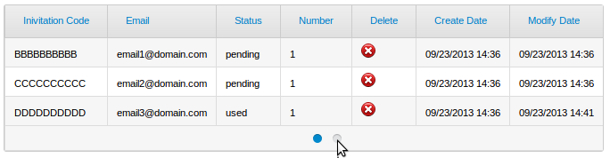
Bullet paging component which displays current page, next n (customized, default 5) pages with ability to jump to pages.
Current page has filled bullet. When mouse goes over, shows number of resources to fetch (1-10).
ContentList
Gets integrated into the jxListContentFoot:
<div class="jxListContentFoot" style="margin-top: 10px">
    <div id="id_groups2_paging_comp" data-xp-type="paging.bullet"
        data-xp="{  compId: 'id_groups2_comp',
                    numberPages: 2,
                    numberResources: 3}" class="ui-list-content-paging"> </div>
</div>
DataList
- pagingStyle: ‘bullet’
- numberResults: 3
- numberPages: 2
Attributes
- compId :string : Id for list component
- numberPages :number : Number of pages for list
- numberResources :number : Number of resources in the list, used to display result pointers in page links (1-10, etc...)
PagingMore
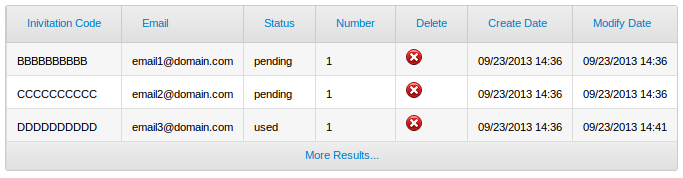
Paging with More link. AJAX call will populate next page.
ListContent
Gets integrated into the jxListContentFoot:
<div class="jxListContentFoot" style="margin-top: 10px">
    <div id="id_groups2_paging_comp" data-xp-type="paging.more"
            data-xp="{compId: 'id_groups2_comp'}" class="ui-list-content-paging">
        More Results...
    </div>
</div>
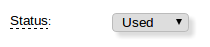
Select
Html
<div id="id_status_comp" data-xp-type="select"
                            data-xp="{  labelWidth: '100px',
                                        info: true,
                                        helpText: 'Invitation status'}" > </div>
Attributes
- label : Label
- size : Input box size
- helpText : Tooltip to show
- info : Weather to show tooltip.
- labelWidth : Width for label
Methods
- render
- disable
- enable
- unrender
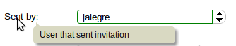
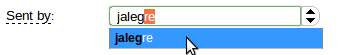
SelectPlus
Html
<div id="id_fromUser_comp" data-xp-type="select.plus"
                        data-xp="{  labelWidth: '100px',
                                    info: true,
                                    label: 'Sent by',
                                    helpText: 'User that sent invitation'}" > </div>
Choices from server-side form field is used by default. You may include field attribute choicesId in the properties
to modify defult value.
As you type text, auto-complete will drop under to help you on selection. For cases withmany entries you will have paging
support on entry list to browse on different pages of results, very handy for big lists.
When you have hasBestMatch the best match is highligted and selected in the input box. So when you start typing in a country
list “Spa”, when best match is Spain will automatically get selected in the text box.
Attributes
- label : Label
- size : Input box size
- helpText : Tooltip to show
- info : Weather to show tooltip.
- labelWidth : Width for label
- hasBestMatch :String : Highlight best match relative to field text. Default true.
- gmaps : Google maps association, like ‘country’. Used for list of countries. Google maps library will set country based on location.
- choicesId : Id for choice list.
Methods
- render
- setValue : Sets value in selection box
- disable
- enable
- unrender
TextArea
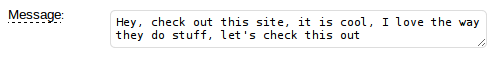
When you set isCollapsible: true, as you type and get to end of row, a new row will be added to text area. This way you
don’t need to size text box and size adapts to size user needs to write. You may start with one or two lines, and as users type,
end up with more lines.
Html
<div id="id_message_comp" data-xp-type="textarea"
                            data-xp="{  labelWidth: '100px',
                                        cols:50,
                                        rows:1,
                                        isCollapsible: true,
                                        info: true,
                                        helpText: 'Invitation message'}" > </div>
Attibutes
- label : Label
- size : Input box size
- helpText : Tooltip to show
- info : Weather to show tooltip.
- labelWidth : Width for label
- cols
- rows
- isCollapsible
Methods
- render
- disable
- enable
- unrender